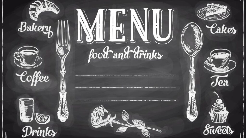
A menu board does more than list prices; it shapes how customers experience your restaurant or cafe from the moment they walk in or pull up to order. A cluttered, hard-to-read board can slow down lines and frustrate customers, while a clean, well-organized one speeds up decisions and reflects positively on the business. Epic Signs and Graphix works with food service businesses to design menu boards that are easy to navigate, visually appealing, and built to last through daily use.
## Why Menu Board Clarity Matters
Reducing Customer Decision Fatigue
When customers face a confusing or overcrowded menu board, they often take longer to decide, which slows down service and creates backups at the counter or drive-thru. A well-organized board groups items logically, uses clear categories, and highlights popular choices, helping customers make faster decisions. This not only improves the customer experience but also increases overall throughput during busy hours, which directly benefits the business through shorter wait times and smoother daily operations.
Reinforcing Brand Consistency
A menu board is a prime opportunity to reinforce brand identity through color schemes, fonts, and imagery that match the rest of the business’s branding. When the menu board feels disconnected from the restaurant’s overall look, it can create a subtle sense of inconsistency that customers pick up on, even if they can’t quite articulate why. Aligning the menu design with logos, color palettes, and overall store aesthetics creates a more polished, trustworthy impression from the moment someone starts reading.
Designing An Effective Menu Board
Organizing Items By Category And Priority
Grouping menu items into clear categories, such as appetizers, mains, and beverages, helps customers scan the board quickly rather than reading every line individually. Placing higher-margin or popular items in prominent positions, like the top or center of the board, can also gently guide purchasing decisions. This kind of strategic layout isn’t about tricking customers; it’s about making the ordering process smoother while naturally highlighting dishes the business wants to feature.
Choosing Readable Fonts And Sizing
Menu boards are often viewed from a few feet away, sometimes while customers are standing in line or driving up to an order window. Fonts need to be large enough and simple enough to read quickly under these conditions. Overly decorative or thin fonts might look appealing up close but can become difficult to read from a distance. Prioritizing legibility over stylistic flourishes ensures the board functions well during busy periods when speed matters most.
Planning For Easy Updates
Menus change, whether due to seasonal items, pricing adjustments, or new offerings. A well-designed menu board should allow for updates without requiring a full replacement every time something changes. Options like digital menu boards or modular panel systems make it easier to swap out sections as needed. Planning for flexibility from the start saves businesses time and money compared to redesigning the entire board each time a small change is necessary.
FAQs
1. What Size Text Works Best For Menu Boards?
Text size depends on viewing distance, but headline items are typically 2-4 inches tall, with smaller supporting text remaining clearly legible from several feet away.
2. Are Digital Menu Boards Better Than Printed Ones?
Digital boards offer easier updates and rotating content, while printed boards are often more budget-friendly and require no technical maintenance or power source.
3. How Often Should A Menu Board Be Updated?
This depends on how frequently a business changes its offerings, but seasonal updates every few months are common for keeping menus fresh and relevant.
4. Can Menu Boards Match A Restaurant’s Branding?
Yes, colors, fonts, and layout can all be customized to align with existing branding, creating a more cohesive customer experience throughout the space.
5. What Materials Are Used For Indoor Menu Boards?
Common materials include acrylic, PVC, and printed vinyl panels, chosen for their durability, easy cleaning, and consistent appearance over time.
A thoughtfully designed menu board keeps lines moving, reinforces your brand, and makes ordering easier for every customer who walks through the door. Small improvements in layout and readability can add up to a noticeably better dining experience.
Reach out to Epic Signs and Graphix at https://epicsignsandgraphix.com/ and let’s design something that works as efficiently as your kitchen does.